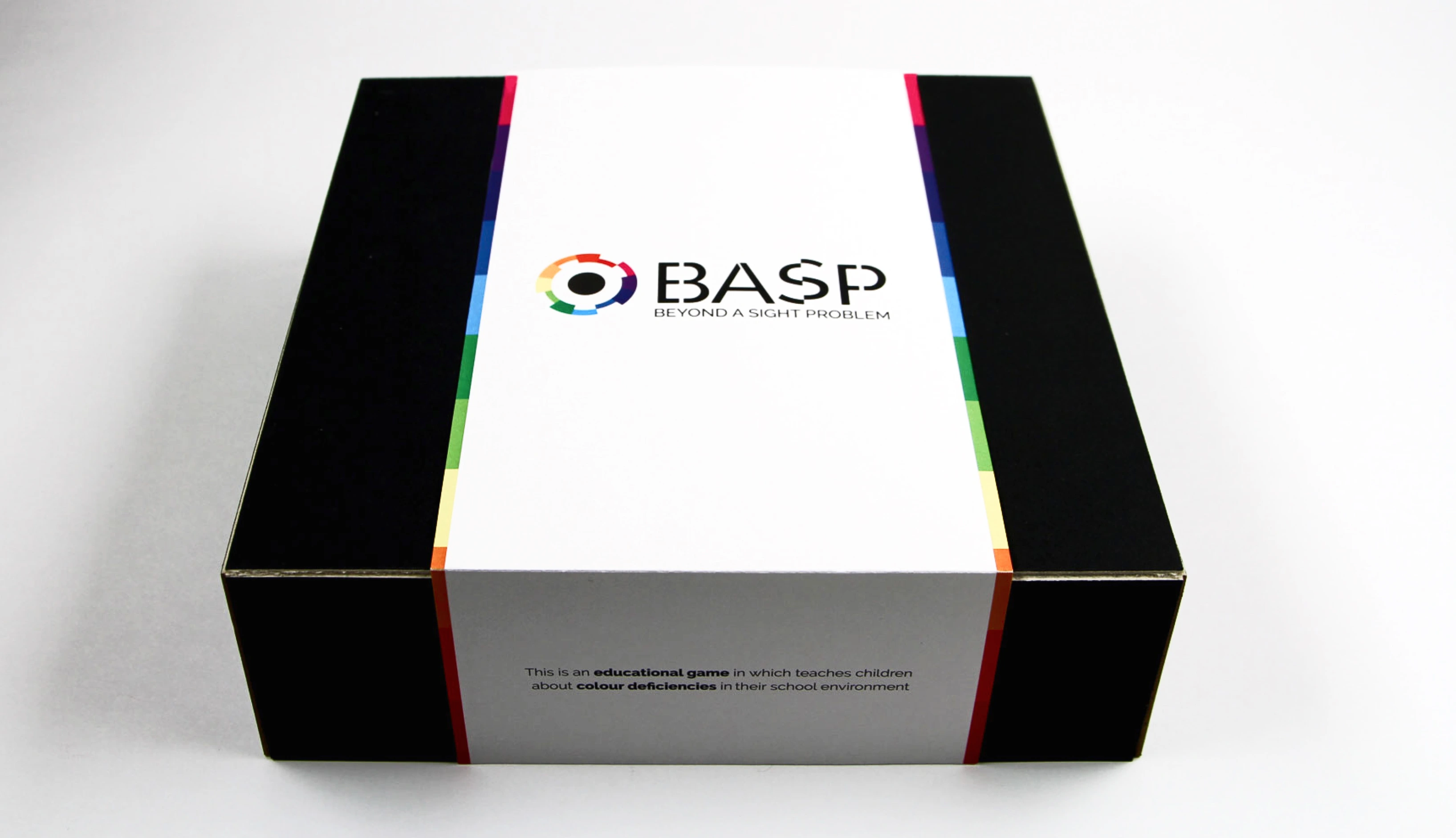
An award-winning thesis project: a public awareness campaign designed to educate families about colourblindness to encourage early screening in children before age 10.
Package Design
Branding
Freelance
Student Project
Role
Graphic Designer
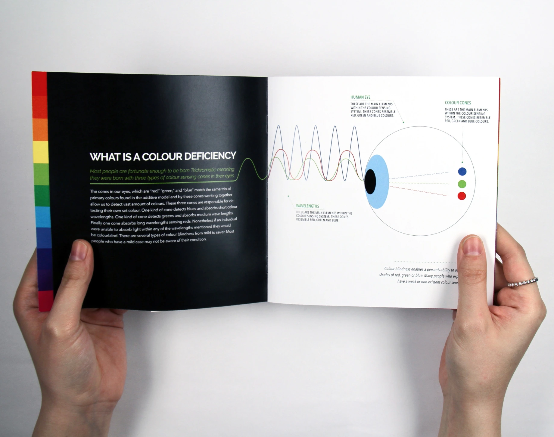
Colourblindness is widely overlooked in early childhood development, with no standardized screening in schools or routine testing in medical settings. As a result, many individuals go undiagnosed until adolescence or adulthood—impacting learning, confidence, and everyday experiences. Research, including interviews with educators and optometrists, revealed a critical gap: a lack of accessible educational tools and awareness within both classrooms and healthcare environments. The challenge was to create a design solution that could effectively reach both parents and children, communicate a complex and often invisible condition, and inspire proactive screening at an early age.
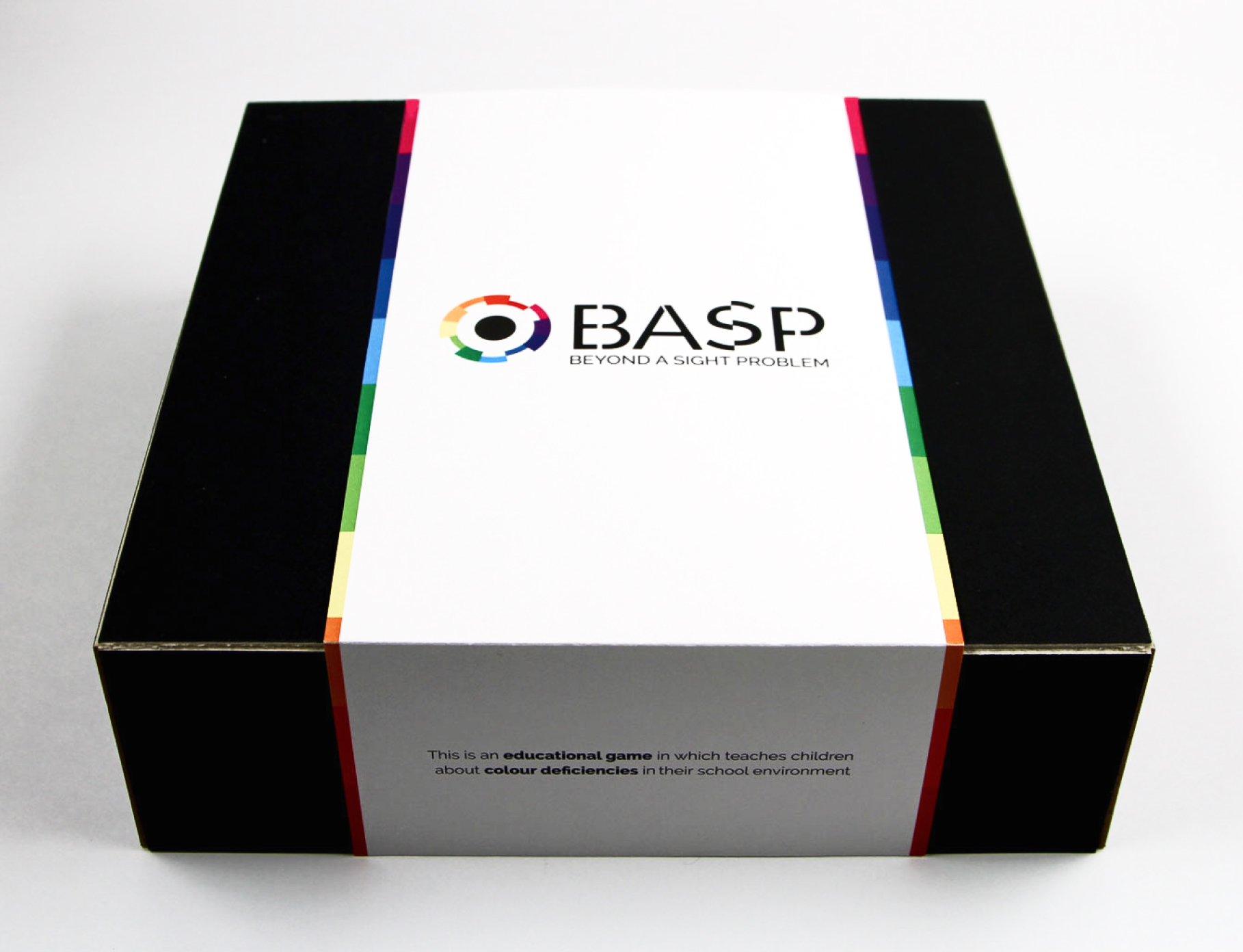
Beyond A Sight Problem is an awareness-driven campaign that bridges the education gap around colour vision deficiency. By combining informative messaging with experiential design elements that simulate colourblindness, the campaign builds understanding and empathy among parents and children alike. Targeted toward young families, the initiative encourages early screening before age 10—empowering caregivers with knowledge and helping children receive the support they need sooner. The visual language and messaging are designed to be engaging, accessible, and easily integrated into schools and healthcare environments.
The campaign is designed to be implemented across both educational and healthcare environments, including schools, doctor’s offices, and optometry clinics. By placing materials in these trusted spaces, the project increases visibility and encourages early conversations around colour vision deficiency. The combination of passive awareness tools and interactive experiences allows the campaign to engage both children and parents in meaningful and accessible ways.
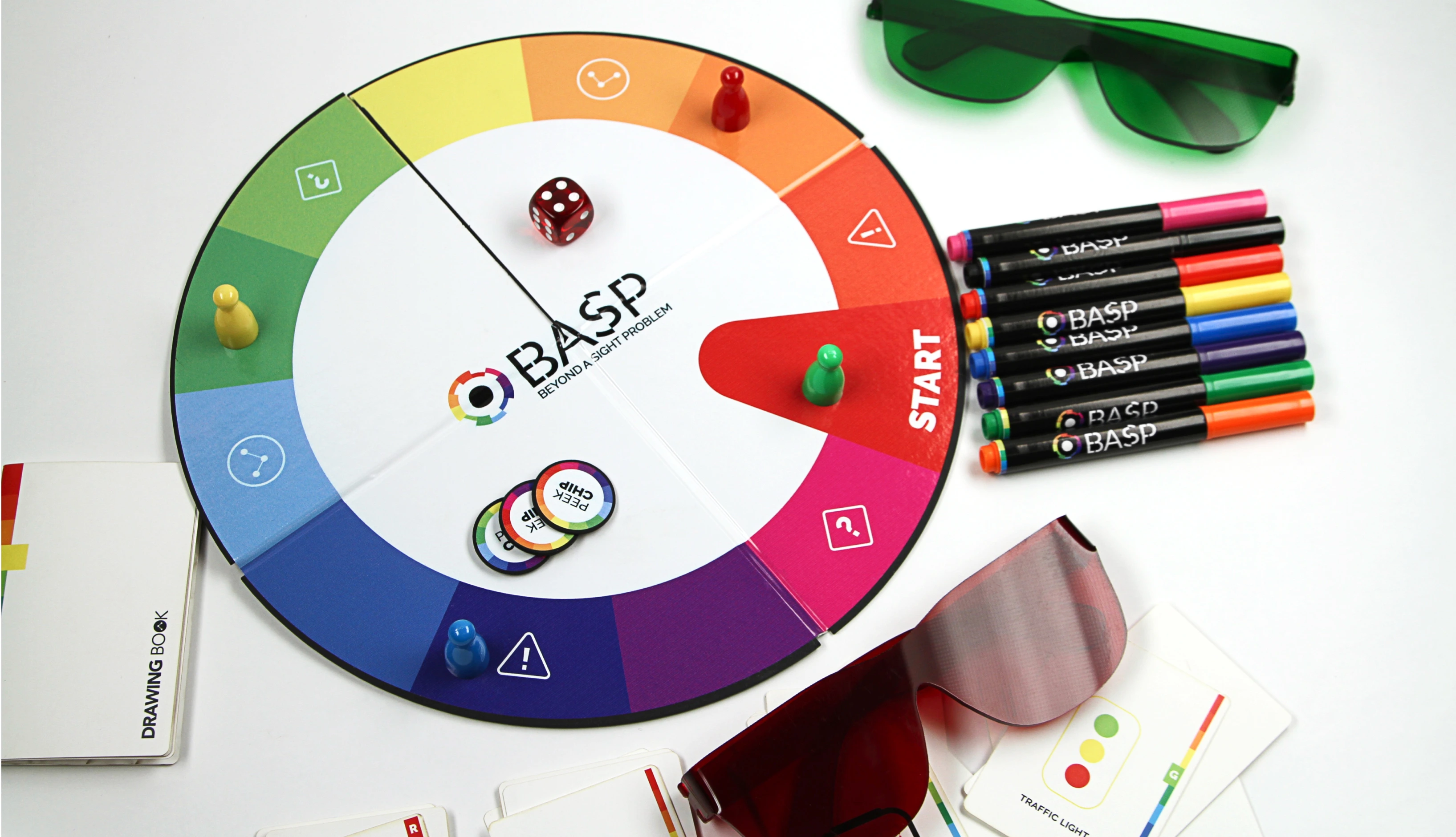
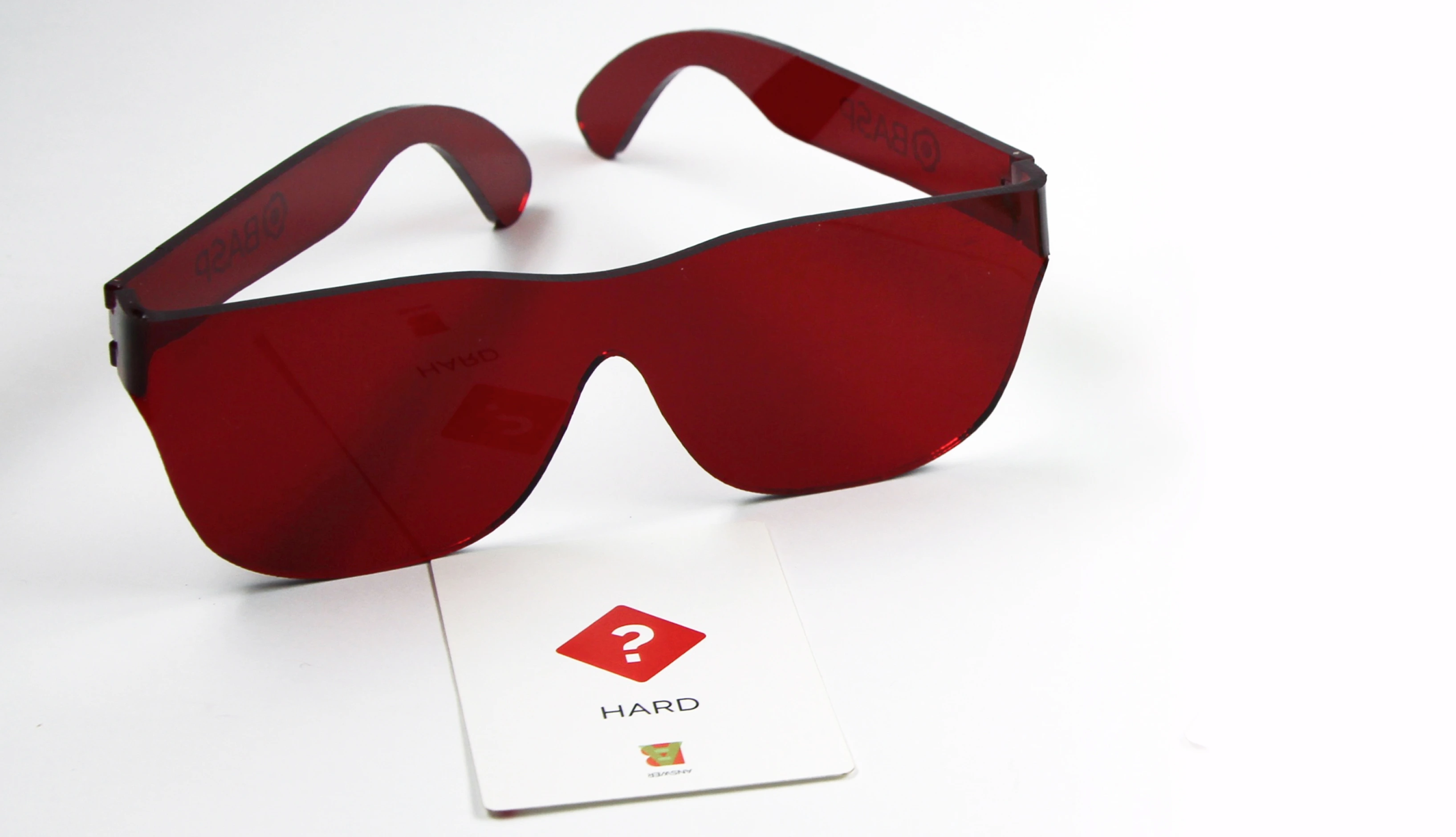
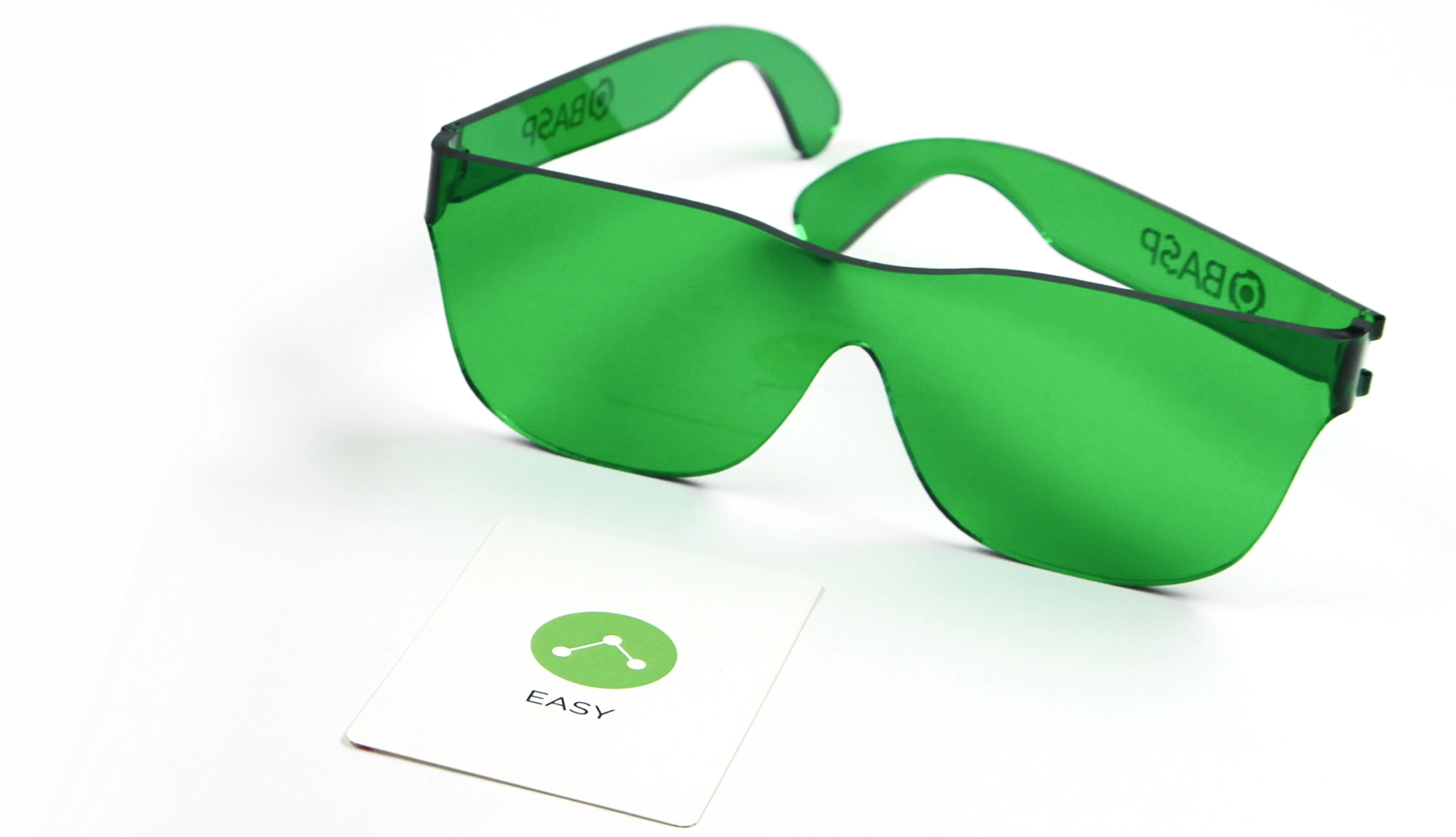
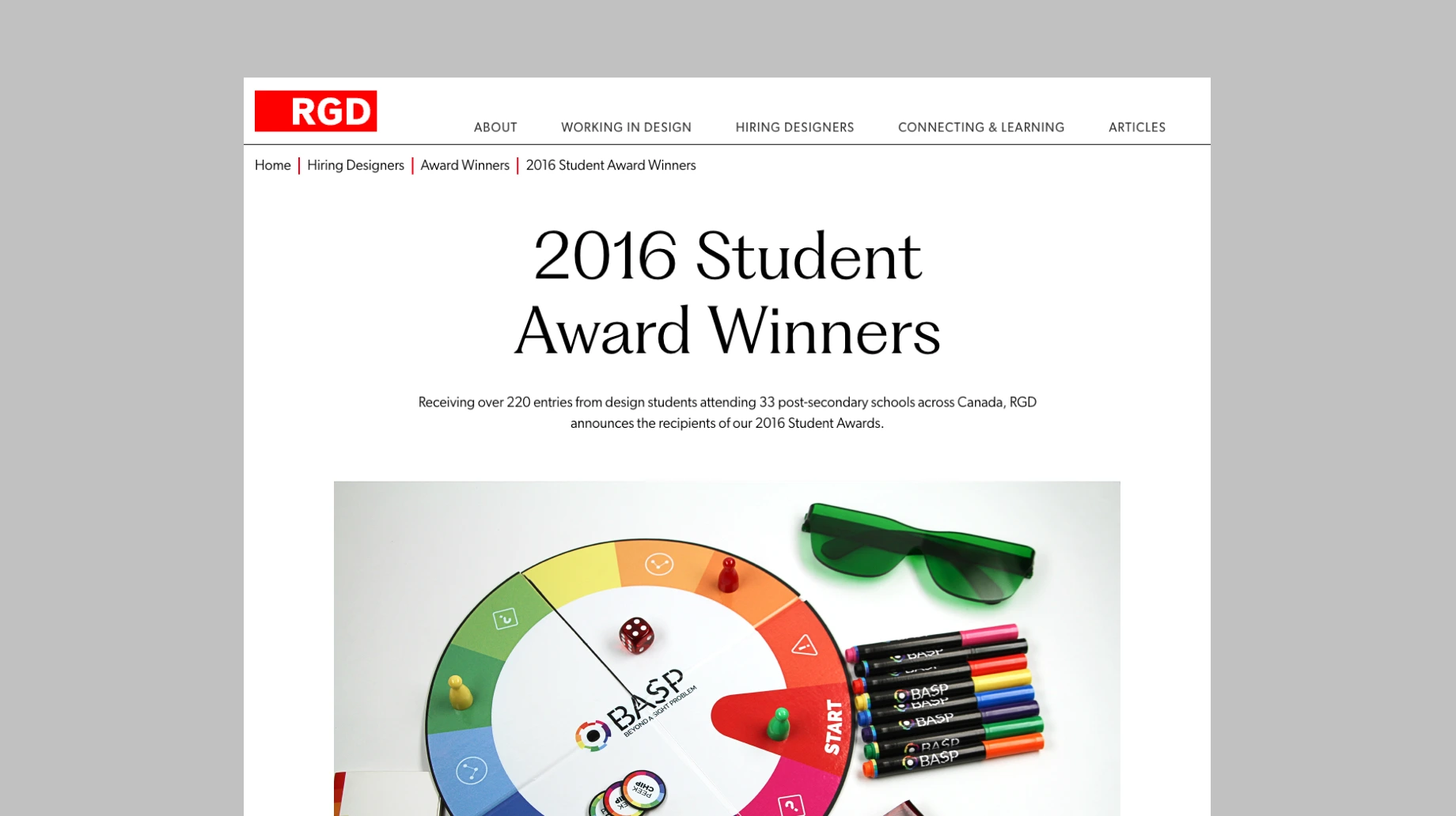
An interactive board game designed for classroom use, the game simulates colourblindness using tinted glasses that alter how children perceive colours. Players navigate the game through these lenses, collecting chips and answering questions about the cards they see, experiencing firsthand the challenges of colour vision deficiency. By putting children in the shoes of someone with colourblindness, the game fosters empathy and awareness while keeping students engaged through hands-on, collaborative gameplay.
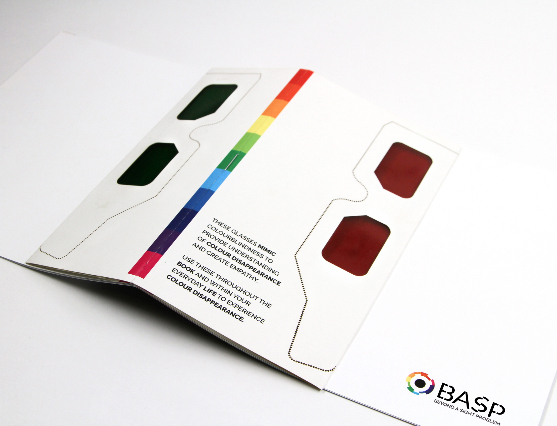
The interactive brochure is a hands‑on educational tool designed to deepen understanding through experience. It comes with specially tinted glasses that adjust how light and colour contrast are perceived—filtering specific wavelengths so familiar colours shift in appearance for the viewer, similar to how red‑green colour vision deficiency alters colour perception.
Within the brochure, certain elements are intentionally designed to hide or reveal information when viewed with the glasses, creating visual challenges that mimic aspects of colourblindness. As readers explore the pages, this interplay between visible and obscured content helps illustrate how colour contrast affects what people see, building empathy and reinforcing the importance of early screening and awareness.
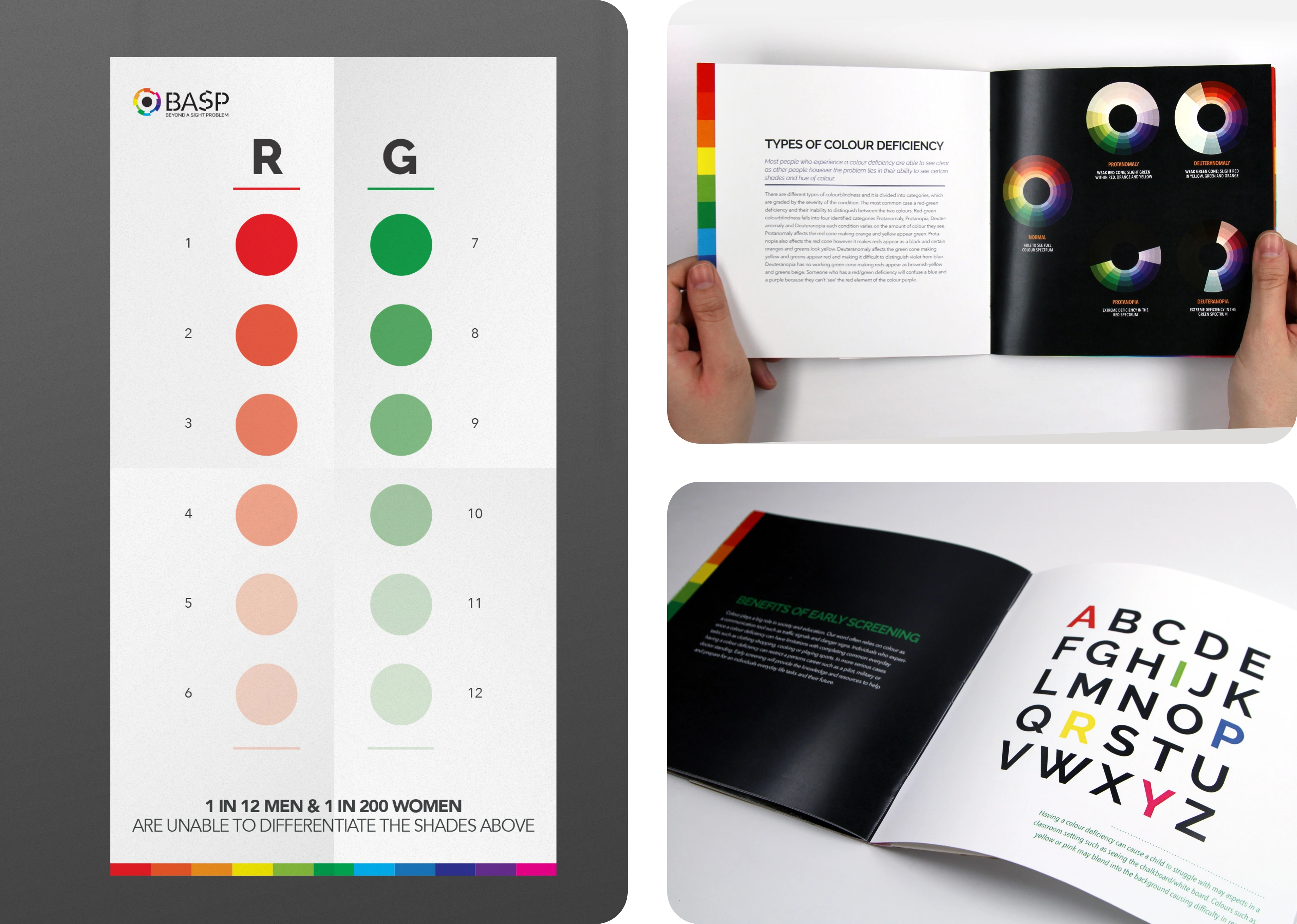
The poster was designed to mimic the familiar format of a traditional eye chart found in optometry clinics. Reimagined through the lens of colourblindness, it uses colour-based challenges to disrupt expectations and draw attention. Installed in school hallways and waiting areas, the poster acts as a conversation starter—prompting curiosity, discussion, and awareness around colour vision deficiency.
This project won the BOLD Award for Accessible Design, recognizing its innovative approach to accessibility and education.
Whether your need support with designing, consulting or learning, let's bring your ideas to life.
© 2026 April Madonia. All rights reserved