Partnered with cross-functional teams to design and implement a scalable CRM system, improving consistency, accessibility, and brand trust across communications.
Design System
Digital Marketing
Agency
GALE Partners
Role
Senior Designer
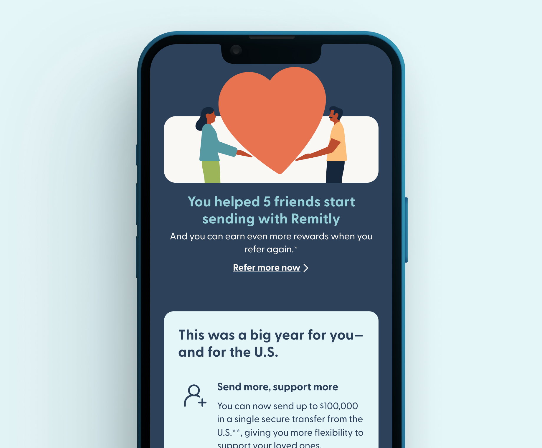
Remitly is a global cross-border payments company that helps millions of customers send money internationally, often to support family members. Because these transactions are deeply personal and high-stakes, trust is critical to the customer experience.
As Remitly grew, inconsistencies began to emerge across CRM communications, from layout and colour usage to component structure, making it increasingly difficult to maintain a cohesive and recognizable brand—at a time when trust is critical, particularly in regions where customers are highly sensitive to fraud and scams.
The client was ready for an evolution in how they produced CRM communications, moving toward a more flexible and scalable approach to email production that could better support personalization, accessibility, and speed.
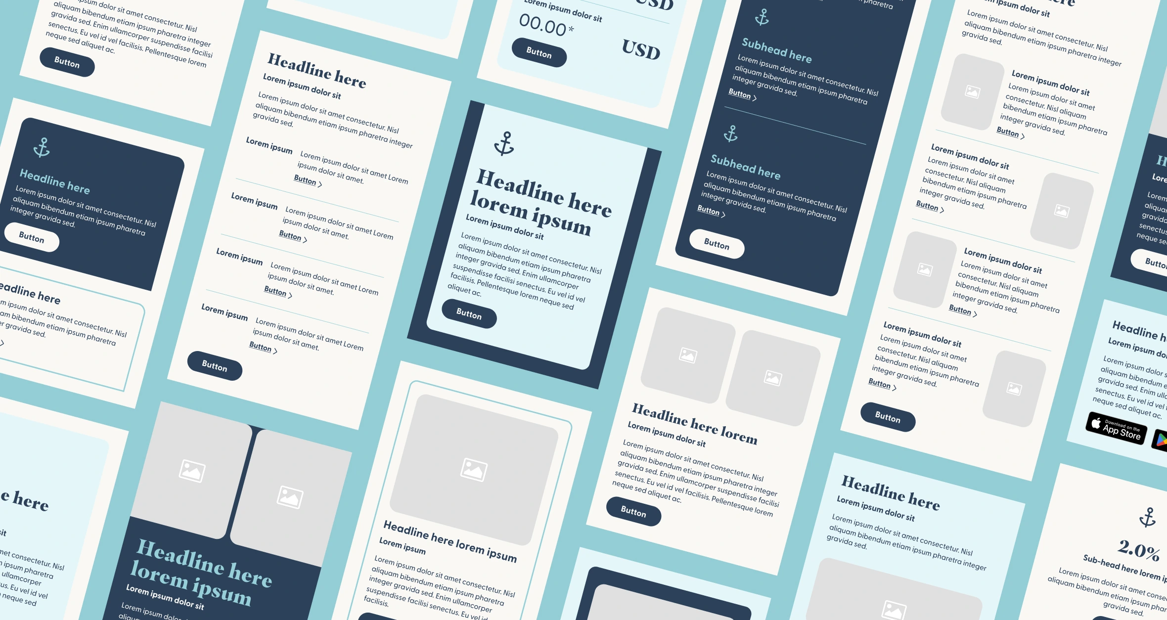
We built a unified design system and modular email framework that prioritized consistency, speed, and build in brand identity elements. At the core of the solution was a component library designed to work directly within Braze. By aligning every module 1:1 with Braze’s drag-and-drop functionality, the team could quickly assemble emails without compromising design quality.
We also used the design system as a way to strengthen Remitly’s brand. By standardizing colour, typography, and layout patterns, we created a more cohesive and recognizable experience—helping emails feel more credible, accessible, and trustworthy. The result was a system that enabled fast production while reinforcing brand consistency at every touchpoint.
After implementing the design system, we applied it to Remitly’s campaign track work to evaluate performance. We put it to the test using modular components, scalable tokens, and a refined colour palette to produce consistent, accessible, and personalized messages more efficiently. The results spoke for themselves, with strong engagement metrics demonstrating the effectiveness of the system.
I led the creative strategy and development of Remitly’s CRM design system, mapping variable boards and building a scalable component library, while collaborating with strategists, designers, developers, and technical teams and bridging the gap between design and development.
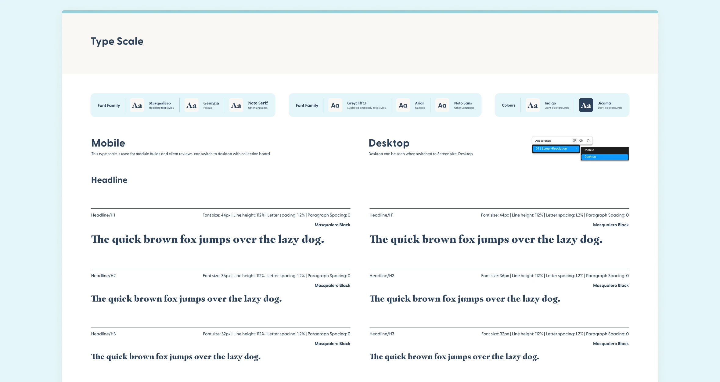
We strengthened Remitly’s brand directly within the design system by creating a more controlled and adaptable approach to colour, pre-made modules, and strong foundational standards covering structure, typography, buttons, accessibility, and supporting documentation. This ensured brand elements appeared consistently and reliably across all email environments—something especially important for building trust at scale.
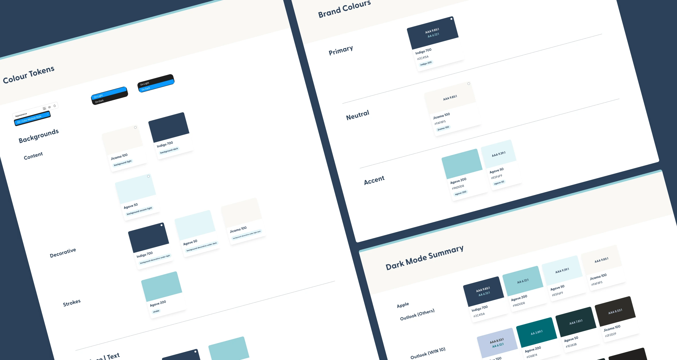
Remitly’s brand included a wide range of colours with specific naming conventions that lacked functional structure, making it difficult to control and apply consistently across campaigns. During our creative audit, we identified gaps in how colours were being used—particularly across different email clients and dark mode environments.
We then evolved the palette into a flexible, token-based system, organizing and standardizing colours to make them more usable at scale. This provided the team with a reliable set of tokens to support accessibility, ensuring WCAG AA compliance while maintaining brand consistency across both light and dark modes.This created a stronger visual foundation, making it easier to design consistent and accessible communications across all campaigns.
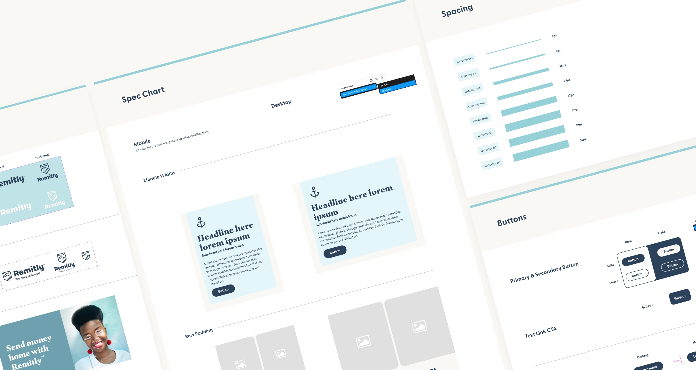
All modules were built mobile-first to prioritize the most common user experience and maximize productivity. While the majority of components do not require a desktop preview, each module includes the ability to scale to desktop layouts when necessary.
Complex modules that require desktop-specific design were heavily documented for developers, including guidance on text styles and sizing to ensure consistency across mobile and desktop.
This approach allows the team to rapidly assemble modular components for multiple campaign types, maintaining consistency, accessibility, and efficiency across both desktop and mobile emails while keeping mobile as the primary, scalable design foundation.
After establishing the foundations, we introduced a centralized token system that allows colours to be updated globally through a primitives variable board, making the system easier to maintain and evolve. To further streamline workflows, we added inverse tokens within modules, enabling designers to quickly toggle between on-light and on-dark variations without manual rework—keeping the focus on design decisions rather than repetitive adjustments.
With ~80–85% of users using dark mode in some form, designing for dark environments became essential. To account for unpredictable system-driven dark mode rendering—especially in clients like Outlook—we created a preview layer that simulates how colours shift in real inbox environments. Since these overrides can’t be fully controlled in development, this allowed designers to anticipate how emails would actually appear before build.
By designing for these scenarios early, we could adapt elements such as icons and imagery to ensure they remained visible and accessible in dark mode—preventing issues where assets might lose contrast or become unclear.
On top of the full component library, we delivered ten fully designed email templates ready for immediate use. Whether it’s a lifestyle email, promotional offer, or newsletter, these templates require no additional design work—the Remitly team simply drops in images and copy.This setup allows the team to quickly produce consistent, accessible, and engaging campaigns, leveraging the modular components and scalable design system for faster, more efficient email production.
Whether your need support with designing, consulting or learning, let's bring your ideas to life.
© 2026 April Madonia. All rights reserved